Supermarkets have numerous shelves and a wide variety of merchandise. To help customers find and select the products they want quickly and easily, items are categorized and placed in different sections. Lighting plays a crucial role in distinguishing various types of merchandise.
As we all know, adequate lighting is essential for ensuring clear visibility in a supermarket. However, general lighting alone is not sufficient to highlight merchandise and make it appealing. Lighting should be designed based on the store layout and the prominence of the products on display. Well-designed lighting can create a comfortable atmosphere, making customers feel at ease and more likely to make a purchase.
Designing effective supermarket lighting can be complex, but it is essential for enhancing the shopping experience.
The aim of supermarket lighting
To determine the appropriate lighting for a supermarket, it's essential to understand the goals of supermarket lighting. The primary aim, above all, is to boost sales. In other words, supermarkets should provide a comfortable and relaxed shopping experience through proper lighting, encouraging customers to make purchases.
Visual effects significantly influence customer decisions. The basic requirement for supermarket lighting is to illuminate the merchandise effectively. Only when products are clearly visible and recognizable to customers do they have the potential to be selected. Highlighting the attractive features of merchandise, such as shape, texture, and color, helps capture customers' attention.
Beyond increasing sales, cost-effective and energy-saving lighting is highly valued by supermarket operators. Lowering costs leads to higher profits. Additionally, easy installation and low maintenance further reduce total expenses. As traditional light sources are gradually being phased out, LED lights are becoming the preferred choice for supermarket lighting.
Supermarket lighting considerations
Customers and merchandise on shelves are supposed to be taken into account in designing supermarket lighting. For customers, the lighting should be enjoyable without glare or flicker. The merchandise on shelves should be lit up and added with accent lighting to highlight their freshness or attractive features. To meet former requirements, following considerations are critical.
Lighting experience for customers
We know that the major point of supermarket lighting is to motivate customers to purchase products. Therefore, the lighting design mainly focuses on the visual effects for customers.
Customers search and then select the merchandise from shelves. The sensitive area of customers' visual field ranges 180 degrees horizontally and 150 degrees vertically. When customers search for merchandise, they will first notice the merchandise on the shelves that is flush with their eye level. The primary standard for supermarket lighting is to light up the merchandise but also bring sufficient lighting without glare in the customers' visual field.
To ensure optimal visual comfort for customers, selecting fixtures with a low UGR is essential. These fixtures are equipped with PMMA or PC diffusers, which provide high light uniformity and effectively minimize glare.
Contrast ratios
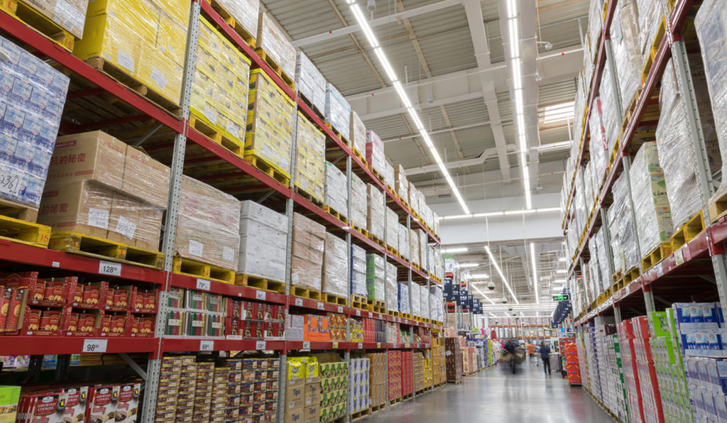
Supermarkets are full of high shelves and various merchandise, vertical illuminance is the leading point in illuminating the merchandise on shelves, while horizontal illuminance is also important. The contrast ratio is related to vertical and horizontal illuminance.
A suitable contrast ratio is capable of directing the gaze of customers, emphasizing merchandise on promotion. The recommended contrast ratio between vertical (shelves) and horizontal (floor) is equal to or exceeds 2:1. For example, the lighting with 300lux illuminance on the floor and at least 600lux at mid-shelves brings a comfortable visual effect.
The layout of fixtures
Fixtures are placed over the aisle between shelves as they can illuminate the aisles as well as ensure vertical illuminance on shelves. If fixtures are located on the top of shelves, the light will blocked by high shelves and cause shadow. This type of fixture layout wastes light and energy. Fixtures should be paralleled to the shelf and aisle. if not, a part of the light will be shielded by shelves, leading to inefficient lighting.
CCT & CRI
CCT (Correlated Color Temperature) brings a different atmosphere and feeling in supermarkets. It can be simply defined as the color of the light source, measured in K (Kelvin). Warm white (below 3000K) makes customers feel more comfortable and relaxed, while cool white (above 5500K) makes customers feel calm.
To enhance the versatility of lighting fixtures, many of our products offer selectable CCT and power. This feature significantly reduces the number of SKUs, helping wholesalers manage inventory more efficiently. For supermarket operators, these adjustable lights provide the flexibility to adapt to different areas, even when the merchandise layout changes.
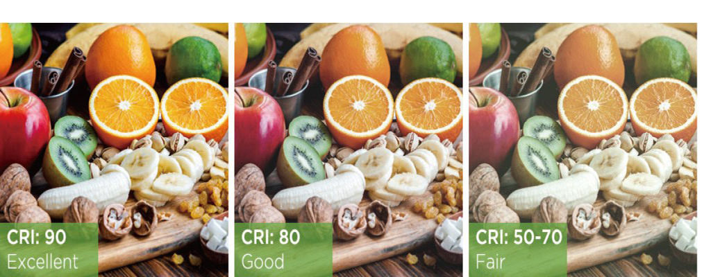
CRI (Color Rendering Index) measures the ability of a light source to render the actual color of objects. CRI ranges from 0 to 100. The higher the values, the better. CRI presents the true appearance of merchandise, affecting the credibility of supermarkets. A CRI value higher than 70 is recommended.
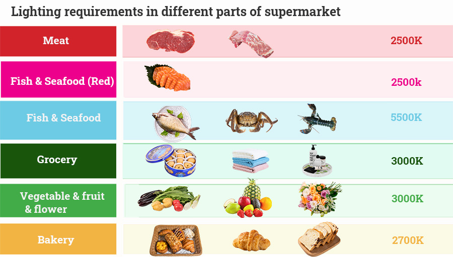
Lighting requirements in different parts of the supermarket
The common merchandises in supermarkets include meat, seafood, vegetable, fruit, bakery, groceries, wine and flowers. Features of merchandise in different parts of supermarkets are varied, resulting in different lighting requirements.
Meat
Most fresh meat looks in red. As a result, the light in warm white with a red glow is great for displaying meat. It makes the meat look fresh and appealing. CCT in 2500K and CRI≧70 are suggested for illuminating meat.
Fish & Seafood
For the fish and seafood that are placed on ice, cool white lighting with CCT of about 5500K makes them shiner and more attractive. Cool white light combined with the color of fish and seafood makes them fresher as if just caught and appealing to customers. However, for the fish and seafood in red, using warm white light with a CCT of about 2500K is more acceptable.
Grocery
Multiple kinds of products are displayed in the grocery section. Contrast ratio of 2:1 between vertical and horizontal illuminance can be used for this section. Lighting for groceries should help customers identify the merchandise and their labels clearly. White (3000K to 3500K) lighting is suitable for grocery.
Vegetable & fruit & flower
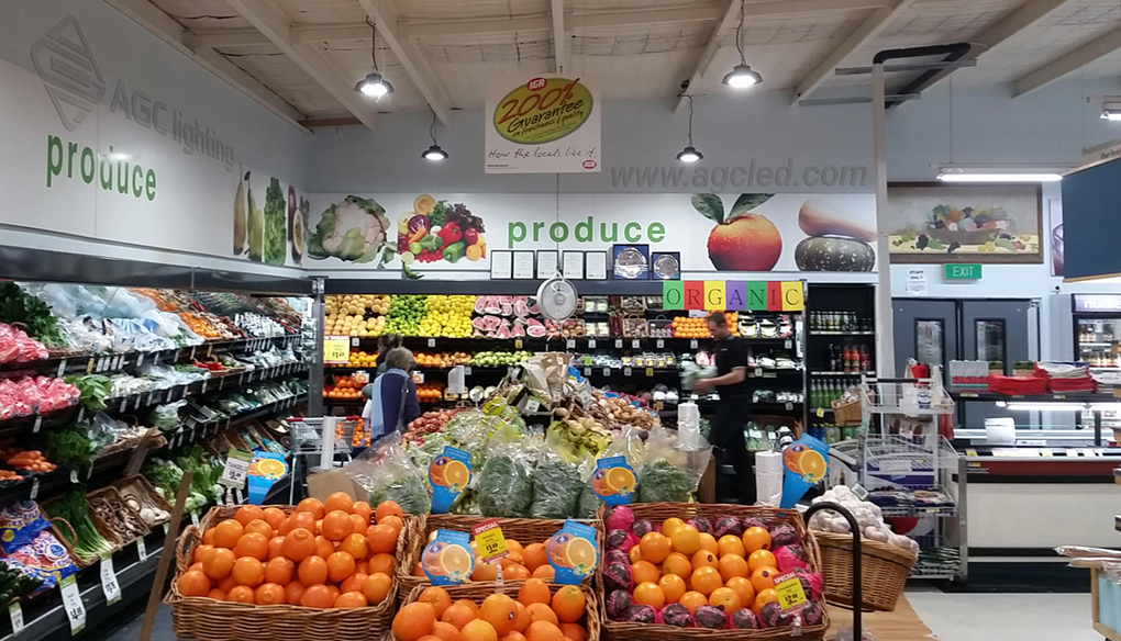
The key point of the display of vegetables, fruits, and flowers is to make sure they are fresh. Warm white light with 3000K CCT and CRI higher than 90 brings out an appetizing and fresh appearance. A contrast ratio higher than 2:1 helps to draw the attention of customers. LED light is the best option for these areas due to the little UV, IR radiation, and heat that will accelerate decay.
Bakery
Lighting for the bakery should make it look delicious as if just taken out of the oven. Warm white lighting with 2700 to 3000K CCT and CRI ≧ 90 is ideal for the bakery. But if exposed to UV radiation for a long time, bakery tends to dry out and fade. LED light can protect bakery from drying and fading due to the minimum UV emission.
Wine
Lighting for wine areas should let customers relax and set off the high-end feeling. Warm white light enables customers to spend more time browsing the areas in a sophisticated atmosphere. Because the bottles of wine are made of glass, using a warm white and low-wattage light source is helpful to avoid glare.
